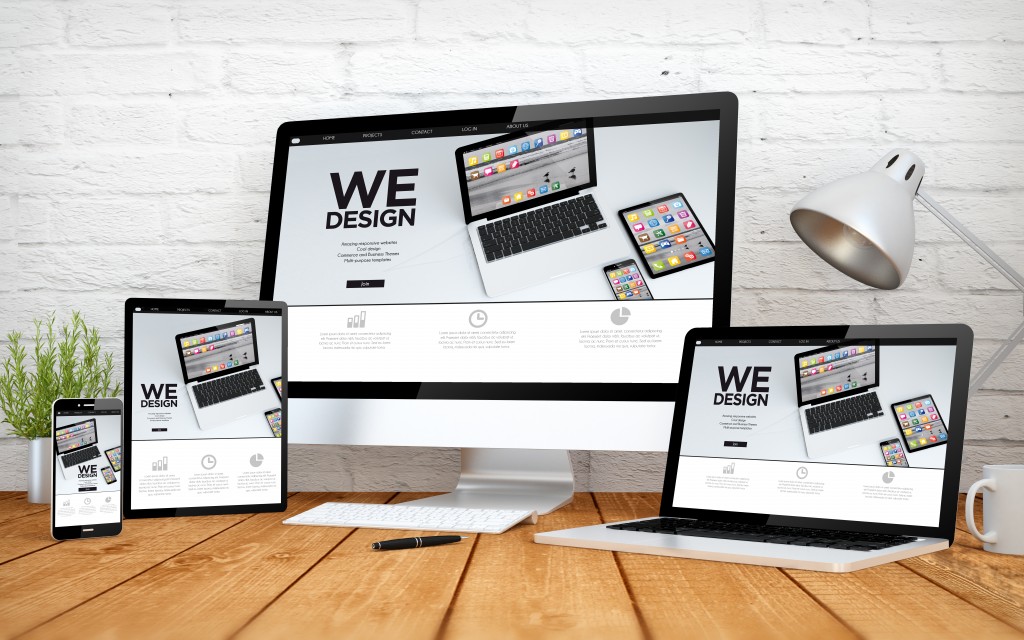
No more than ten years ago, websites were cool when they had an infinite scrolling function. They allowed us to browse websites from our phones without zooming in to click the next page button, which would’ve been too tiny. Social networking sites such as Twitter, Facebook, and Tumblr adopted the function too, and it’s still in effect today.
But in e-commerce sites, the infinite scrolling function didn’t quite work out. The companies that jumped onto the trend failed to enhance user experience, and instead drove web visitors into confusion. Hence, the infinite scrolling trend came to an end, except in websites where they were necessary.
Like the trends in any other industry and in pop culture, web design trends also changed many times over the years. Right now, minimalism is in, but you wouldn’t have guessed that fifteen years ago when users hated “basic” looks. As such, do you think the popular web designs today would look unappealing in the future?
If that’s the case, brands may have a tricky time catching up. Old, established brands like Pepsi and Google weren’t spared from the effects of new design trends, after all. They changed their logos and web designs multiple times to fit the taste of the market. Considering that, does a timeless web design still exist?
Web Design Trends Through the Years
Before delving into timeless design and whether it still exists or not, let’s first explore how web designs have changed through the years:

-
1995 to 2003: Click Me Content
Early websites aimed to catch attention through flash animation, bold and bright colors, and call-to-actions. Visiting a website back then was akin to visiting the Vegas strip or Times Square.
Limited technology supporting web and graphic design led to this trend. At that time, companies were only doing what they could to attract customers. But later on, as design capabilities grew, the Click Me content lost favor and functional web design became the new design preference of customers.
-
2000: White Space
Sometime during the reign of Click Me content, bold and bright colors were replaced by whites. Around 2000, designers realized that users needed a cleaner page layout so that they could identify and process the information they needed better. As that realization proved true, designers began to tone down the loud graphics and focused more on providing useful information.
-
2003 to 2010: Web 2.0
As much as the White Space was practical, it was also too basic, making users bored and unimpressed. So around 2003, developers began creating more interactive content that separated sites from one another. Web 2.0 was when companies started attracting web visitors with an enhanced user experience. Until now, Web 2.0 is still very much alive but has been expanded in more unique ways since 2010.
-
2010 to 2012: Skeuomorphic Design
The skeuomorphic design was trendy for a brief time. It was built off of Web 2.0, but with more immersive elements like creative cursors, backgrounds, icons, buttons, and texts. Basically, it’s a highly customized web design style. But like the Click Me content, the skeuomorphic design was also a little overwhelming to the eyes, leading to its fast downfall.
-
2014 to 2016: Infinite Scrolling
As discussed above, the infinite scrolling function was mostly for the benefit of mobile phone browsers. But since it wasn’t effective in e-commerce, the trend died quickly, except in social media.
-
2012 to Present: Minimalism
From 2012 until today, internet users are hooked to minimalism, favoring web designs that are easy on the eyes but still unique and engaging. Moreover, they are now more focused on information, and a minimalist web design allows them to easily spot what they need, or even signs of malicious content such as phishing scams. And of course, the aesthetic standards of today’s internet users have become pretty high.
Is Your Web Design Timeless?
A timeless design, after everything, still exists. To come up with such a design, your website should focus more on content than aesthetic elements. Gimmicks like a customized cursor, quirky fonts, and plugins are no longer necessary. If you want them on your website, they must have a purpose.
If your content is readable, meaning it has a simple typeface, high-quality images, and a design that has a clear meaning, it passes the standards of a timeless design. But to achieve it 100%, your website also needs interactive content like eye-catching photos and videos, good visual scale, and accents like typography, pops of color, interesting texture, and unexpected elements. Mind the navigation as well; every user should find your website easy to explore.
Furthermore, don’t forget to match your web design to your brand’s aesthetics. If your brand colors are red and blue, find a way to make those colors blend beautifully on your website. Don’t just use a free web-development platform with free themes. Find skilled web designers from reputable online sources such as websitedesigners.london for the job.
Note, however, that even if you have a timeless web design, it doesn’t mean you shouldn’t change it over time. To keep users interested, tweak things once in a while. It will maintain your website’s freshness and competitiveness.
