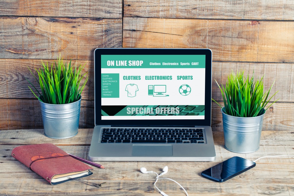
E-commerce websites exist to do one thing: simply the shopping experience. Your customer chooses to shop online because it’s easier and faster. This means that your online store must facilitate the purchasing process to ensure that the user will check out their orders.
A well-designed e-commerce website is both visually pleasing and easy-to-use. It’s intuitive and simple without being boring. To achieve these qualities, you have to anticipate what an online shopper would need, expect, and demand in a digital shopping experience.
Most of the elements and features of your online store would depend on the demographics, psychographics, and online behavior of your target audience. But there are several design must-haves in every e-commerce website, regardless of what you’re selling and who you’re selling to.
Below are five website design elements of a high-converting online store.
1. Impactful Homepage
Your homepage should communicate your branding, unique selling proposition, and added value. It should show users why they should choose your brand.
Apart from making a good first impression, your homepage should also feature whatever you want your customers to see first. Do you have new product releases? Are you holding any discount sales? Be sure to promote those on your homepage.
The homepage should be useful both for existing customers and first-time visitors.
2. Powerful Call-to-action
Call-to-action buttons prompt a response from the user, whether it’s to ask them to buy now, learn more about the product, sign up for a newsletter, or create an account.
One benefit of CTA buttons is to immediately redirect users to pages they’re looking for. Another is they make effective lead generators.
Make sure that your CTAs are visible and well-exposed on the page. Keep the text short and punchy.
3. Clear Navigation
Your online store contains hundreds of products and it’s going to be difficult for your shoppers to look through each one. There are multiple ways to create a clear navigation on your e-commerce website.
You can have a collapsible main menu. The navigation panel on online shops can get long, taking up plenty of screen space. A collapsible menu gives the user more real estate on the screen when browsing. This is especially helpful for those who use their smartphones for shopping.
Another option is a fat footer. It provides a bird’s-eye view of your website. Shoppers can browse by category and subcategory and jump to important links.
4. Autocomplete Search Bar

A lot of e-commerce websites already have a search bar. This lets users quickly type in the product they’re looking for instead of looking through multiple pages.
You can elevate your search bar with an autocomplete function. This speeds up the search process of the shopper. It’s helpful for products with long, complicated, hard-to-remember names. Users can also see product suggestions when the search bar autocompletes with frequently searched items.
Keep the needs of your ideal customer in mind and use this as a guide when designing your e-commerce website. Your goal is to provide an intuitive, seamless digital shopping experience that pushes consumers further along the buyer’s journey — from awareness, consideration, to decision. If you design your online store right, you’ll be converting new customers one after the other.
